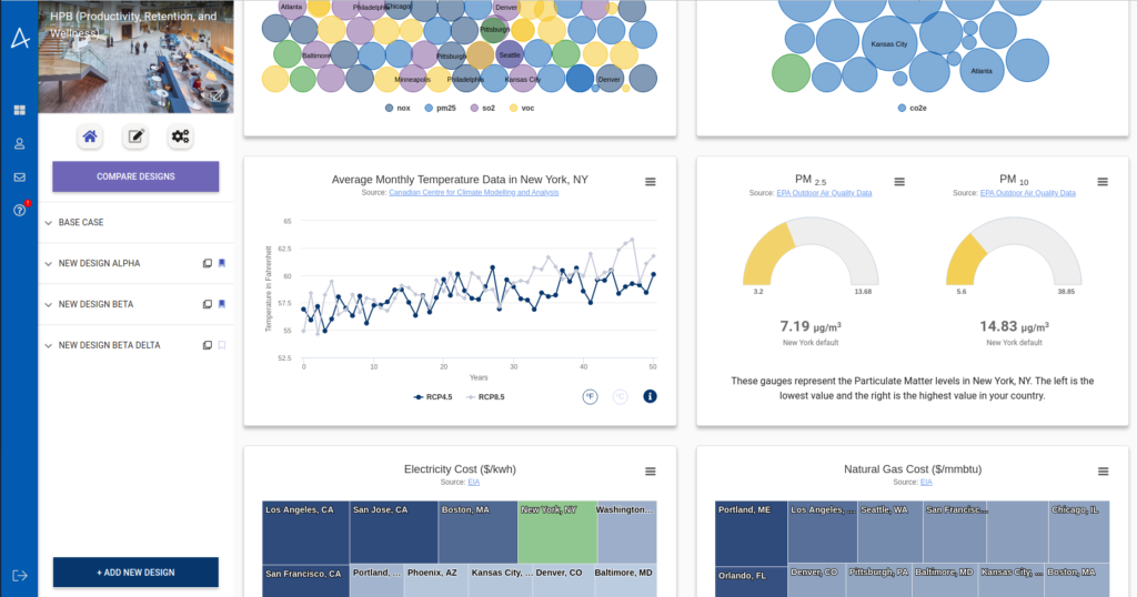
There is a nice location-specific dashboard you see as soon as you open or create your project in Autocase that shows you what environment you project will operate in. Last year we added climate scenarios to Autocase and these show up in the dashboard.
I was curious why the temperature climate scenarios chart had year-by-year wiggles:
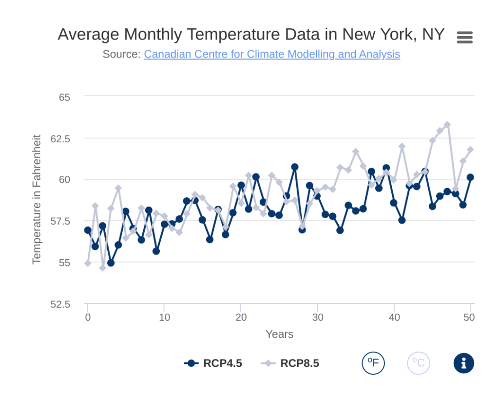
So I asked one of our experts, Aalisha Lakdawala, an economist in our research group. Here’s what she told me. There are three reasons behind the upward and downward movements seen in the graph.
- Our source, the Canadian Centre for Climate Modelling and Analysis (CCCMa) uses ensemble modelling – what this means is that given the historical temperature data available from each location or grid, multiple models are run simultaneously to predict the temperature values. These model variations are based on changing the inherent structure of their algorithm or having variations in the training data set itself. There is also variability across models used by different institutions, so some variability is observed there as well.
- Scenario uncertainty. Even though we and CCCMa classify emission scenarios between RCP 4.4 and 8.5, there is still a degree of uncertainty in terms of the scale at which the emissions are expected to increase. This estimation is usually done based on historical samples of data. Minor downward shifts in historical data can come up while doing predictions
- Finally, the climate models are trying to replicate natural variation: These are in a sense the internal components of the climate system – that can show variability between decades.
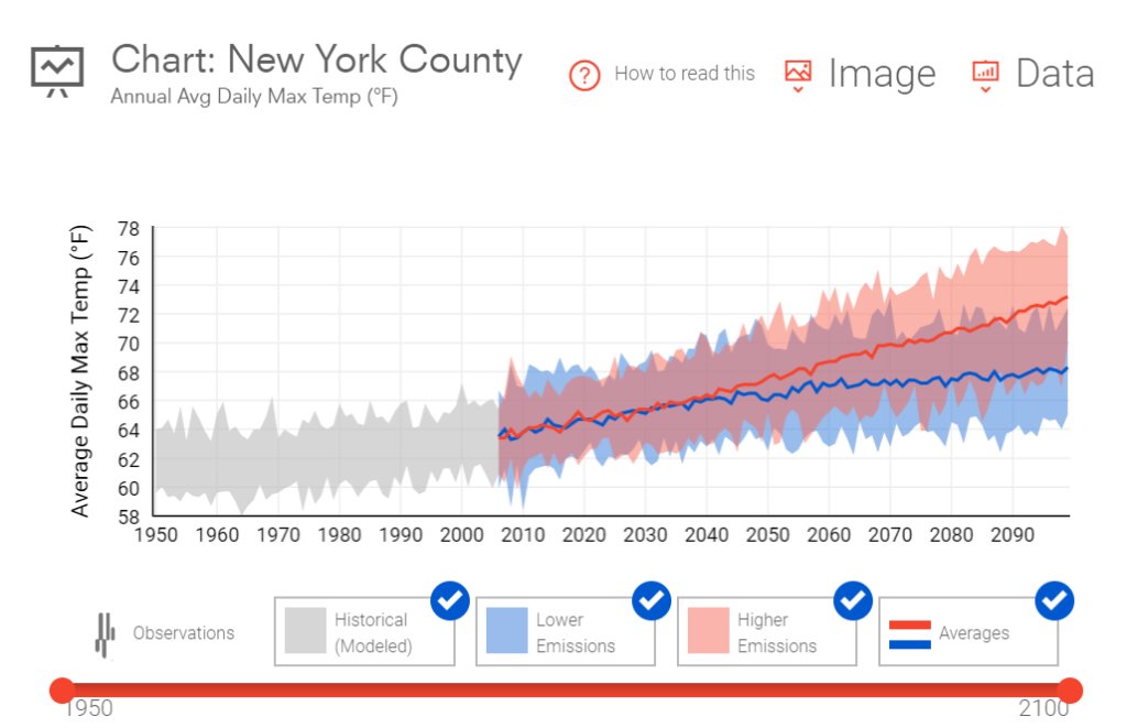
You see similar data trends in other databases. For example the US Climate Explorer has minimums and maximums that moves quite a bit. And while their average is smoother than ours, it still bumps around. There is a chance that the US Climate Explorer has done data smoothing or used seasonal moving averages to reduce effects of seasonality. But they too have wiggles:
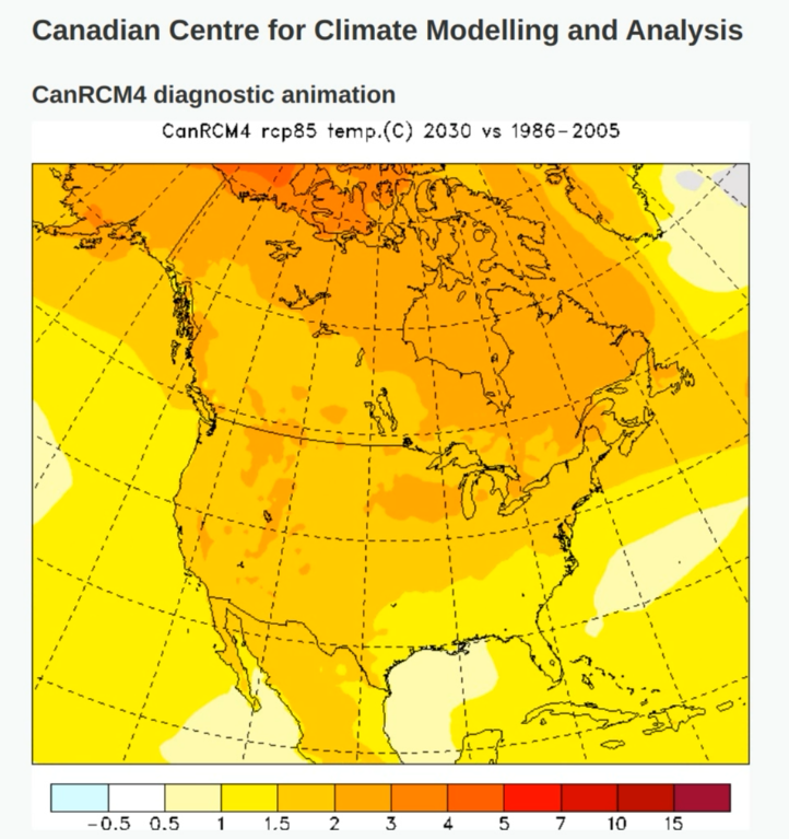
I found this animation from CCMa that shows the same thing. If you look at any place on the map, while there is an inevitable creep towards red (hotter temperatures), year-over-year it can get cooler:
There are more interesting animations here.
If you have any questions, we have a team of professional economists who have answers. Contact us at info@autocase.com